
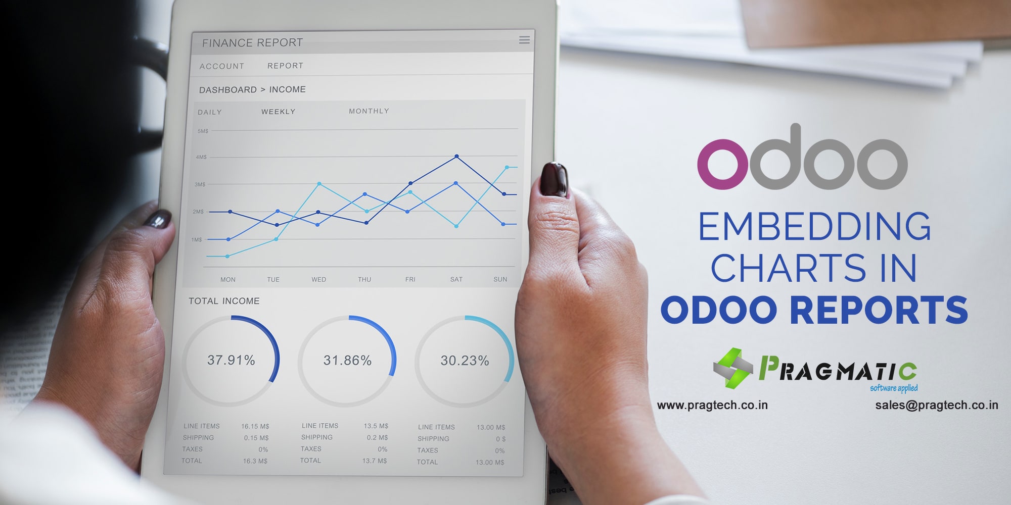
When it comes to reporting, Odoo provides best flexibility in terms of report generation out of the box, An Odoo report can have various kinds of representational elements like images, tables, fonts etc.
But it lacks when it comes to embedding of chart for quick and easy representation of data.
At Pragmatic we have proposed a way through which we can include user friendly charts for improved readability.
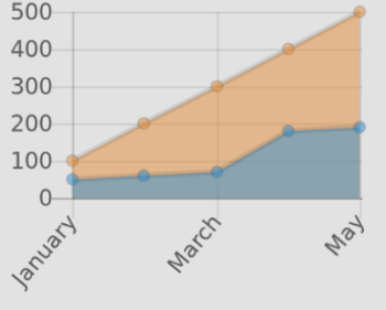
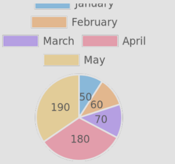
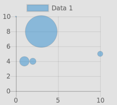
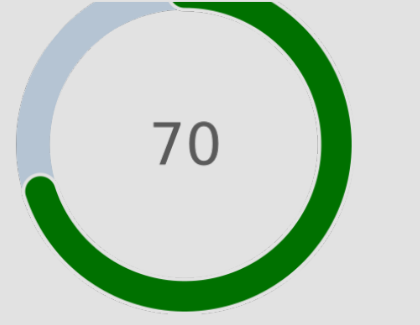
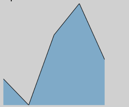
We can plot various kinds of charts like column chart, pie chart, doughnut charts, line charts, scatter plot, bubble chart, mixed charts.
These charts can be customized for user defined colors or labels.
The main advantage of embedding chart in Odoo report is it does not require any third party module dependency or python/JS library. Its completely independent of these extra stuffs.
What you need is only active internet connection for charts to work.
Excited to see the charts ? We have attached some screenshots for your reference.



Let us know your requirement and we can address it with our expert developer team.
Leave a Reply
You must be logged in to post a comment.